Trend lines, not a single number
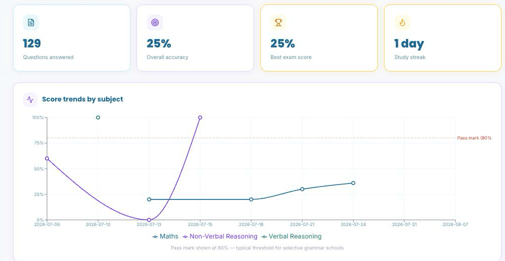
Every subject gets its own line on the same chart, plotted by day, so a score is always read next to where it's heading, not in isolation.
Says "not ready yet" when that's true
The predicted readiness score is a plain weighted average of real answers. It isn't tuned to feel encouraging, and it says so honestly when there's more work to do.
Built from everything, in one place
Practice, tutor-set homework and mock exams all roll into the same subject and topic trends. Nothing is tracked in a separate silo the dashboard can't see.
One dashboard, fed by everything real
This is the exact data behind the real dashboard, nothing simplified or left out for this page.
Every question counts toward the same picture
Exam Readiness, calculated honestly
The predicted score is a weighted average across every practice question answered and every timed exam question attempted, nothing invented. Anything from the last 14 days counts double, so recent effort moves the number faster than something practised months ago.
It only ever lands in one of five bands: Not ready yet, Getting there, On track, Almost ready or Exam confident, the last of which needs a predicted 90% or higher. There's no version of this that flatters an early learner with an inflated number.
A real dashboard, not a mockup
An unedited screenshot from a real test account: the top-line stat cards and the score trends chart, exactly as they appear on the live dashboard, including a subject that's below the pass mark, because that's genuinely where this account stands right now.
Every subject and topic, broken down
The same page keeps going well past the headline chart: here's what's further down it.
Subject breakdown with trend arrows
Each subject gets its own card (total questions, accuracy, and when it was last practised) plus a trend arrow once there's enough recent history (5+ questions in each of the last two fortnights) to call it up, down or stable.
A topic-by-topic heatmap
Every topic becomes its own bubble, sized by how many questions have been attempted and coloured by accuracy, so a frequently-practised topic and a barely-touched one never look the same size on the page.
Personal bests that persist
The single best score ever recorded per subject or topic, with the date it was set, a record that only ever improves, never quietly resets.
Recent activity, unified
The last 10 things done (practice sessions, homework completions, exam attempts) in one combined feed, each tagged by type and linked through to the full result where one exists.
A full exam history table
Every mock exam ever sat, with its timed score, full (untimed) score, and exactly how far into the paper the clock allowed before time ran out.
Spaced-repetition status
A live count of how many topics are currently flagged for reinforcement under spaced review, topics that are fading from memory, not just ones answered incorrectly recently.
Frequently asked questions

Ready to see your own trends?
This page is the honest walkthrough. The real dashboard starts building itself from the very first practice question.